I was fortunate to freelance with the team at Gretel for this rebrand of global technology leader and innovator IBM. With IBM’s global technology services business separating and becoming its own company, the team was tasked with re-focusing and articulating the core brand.
We focused on distilling the iconic 8-bar logo into a single unit: the node. By using the node as a metaphor for the catalyst, it mirrors IBM’s role as a revolutionary force in technology and innovation.
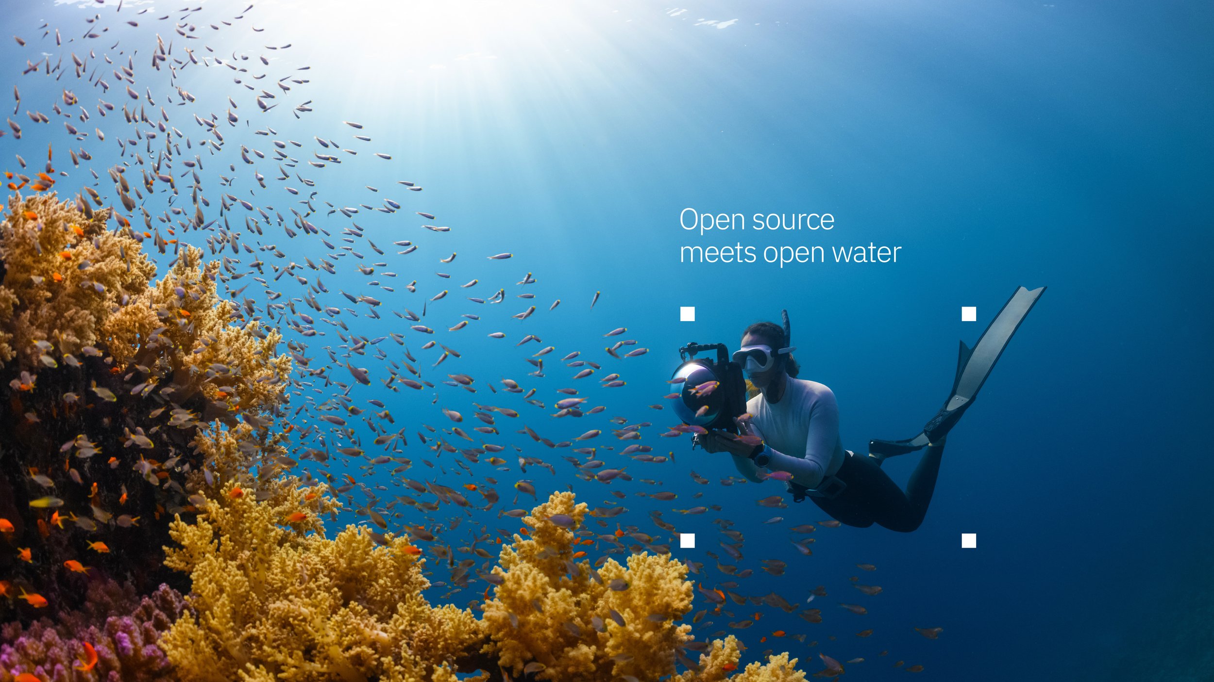
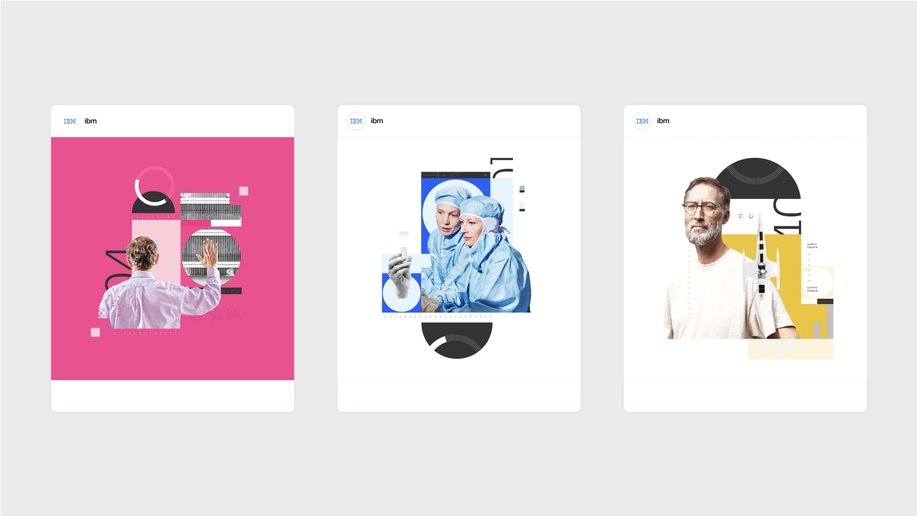
Using this metaphor, we created a design language with a focus on connection: of ideas, industries, and businesses. Using a lighter + brighter brand palette, the visual language is able to communicate these complex connections with intuitive clarity.
To see more from this project, visit Gretel’s case study here.